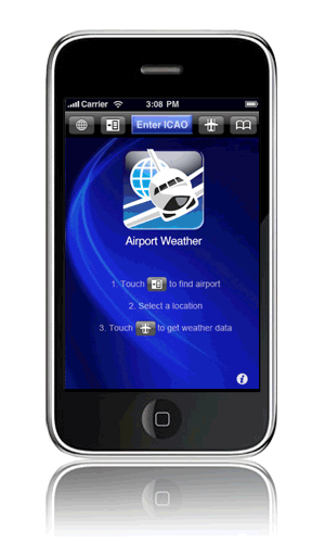
| Fichthorn Designs Airport Weather for iPhone | |
Use Airport Weather when you travel and want to know the weather conditions of your destination or just want to know what the weather is like in another part of the world. Airport Weather is an ICAO* browser. You can use it to find over 5000 weather reporting stations throughout the globe. AP Weather enables you to search NOAA's† public domain METAR server without having to remember over 5000 ICAO codes. An easy to use scroll wheel does not require typing (although type entry is an option) and you can find airports or weather stations throughout world within seconds. You can add and easily edit up to 10 commonly used ICAO bookmarks. |
 |
| Tampa Bay Business Journal | By Shelly Sigo/Staff Writer |
The next time you pick up Hawaiian Tropic suncare, an Eckerd product or Selfcare Stresstabs, you may be motivated by Fichthorn Associates Package Design.The creative agency behind many recognizable labels is a name you'll never see on a shelf, but you'll find it in Tampa. Over the last 15 years, Rick and Karen Fichthorn (pronounced Fick-thorn) have developed an impressive client list that includes Eckerd and Hawaiian Tropic. Success enabled them to buy a home zoned for commercial use that they transformed into an office last year in a quiet Tampa neighborhood at 3438 Colwell Ave. Their colorful, swirling logo is the central theme of the office decor and is crafted into a stained-glass front door, etched in a glassed conference room wall and hung as a tribute to the artist who rendered the first painting of the design unique to the Fichthorn name. The Tampa couple, who modestly claim theirs is a small business, have captured a niche market in packaging design with name recognition where it counts. "When we develop new products, we do focus groups around the country, and people always reach for the Fichthorn box," said Diane Sullivan of Selfcare Inc. Sullivan is responsible for finding the right kind of packaging to market family-planning products, vitamins and items for diabetics that publicly held Waltham, Mass.-based Selfcare manufactures and distributes under private labels and its own name worldwide. A company the size of Selfcare normally would do packaging design in-house. But since 1993, the company has worked exclusively with the Fichthorns, said Sullivan, who spent eight years with key advertising agencies and top designers in New York. "Their ability to blend consumer appeal with product integrity is a talent that is really hard to find," Sullivan said. "Their skills are beyond New York quality." Rick Fichthorn was educated and trained in Florida and New York. He met Karen in an advertising agency in Gainesville. They married in 1983. Three months after opening their own business in 1984, the Fichthorns landed then-locally owned Eckerd Drug. Five years after opening, they landed a contract with Ormand Beach-based Hawaiian Tropic. After Eckerd merged with JCPenney in 1997, the Fichthorns remained the exclusive package design agency for Eckerd products. Of the 50 small and large companies the Fichthorns represent, 70 percent of their clients are outside Florida -- a strategy that helped them find a niche. "We're a quiet company, but we produce the same level of quality no matter who it is for," said Karen Fichthorn, who says her job as manager is to keep all the plates spinning and the projects flowing.
|
"Right now, we have 130 products in various stages." The company's main focus is package design, from conceiving the idea to creating a three-dimensional presentation. It also does advertising, promotions, educational brochures, displays and annual reports. When he worked in New York cultivating expertise in package design in the early '80s, Rick Fichthorn redesigned the Orange Crush label. The same label is on the bottle today. "Packaging is a design discipline more lasting than many marketing efforts," he said. "It has a shelf life that will be around for a while." Competition is fierce and keeps his job as the company's designer challenging, he said. Companies with competing product lines often are forced to redesign within a year after a competitor comes out with a more sophisticated design. It is a competitive game he calls "leapfrog." "We design packages so the consumer understands what it is within three seconds," he said. "A lot of people design in a vacuum, but I think one of the things that has helped us be successful is we get as much input as possible." That is accomplished by teamwork among the company's five full-time employees and a carefully developed relationship between the owners. The Fichthorns consider themselves co-owners in the office, deferring decisions to the one with the most expertise in any given issue, and partners at home, where decisions are made together, they said. "We design packages so we look at them and say, `Oh, cool,' " Karen Fichthorn said. "If we don't get that reaction, we won't get it out of our clients." They designed 510 packages from more than 1,500 different ideas created by Rick Fichthorn last year. When they started in business before computer-assisted design, the firm did all work by hand and produced about 50 packages a year. The Fichthorns say they operate with a business philosophy bolstered by NASA's back-up plan: They never do anything without an option and never buy anything they can't afford. When a client questioned why the design for a two-ounce bottle cost the same as a larger one, Karen Fichthorn explained that the smaller the product, the more difficult it is to communicate. "The price is determined by how successful we are," she said. "We don't have a sales staff. All our clients are from referrals." |
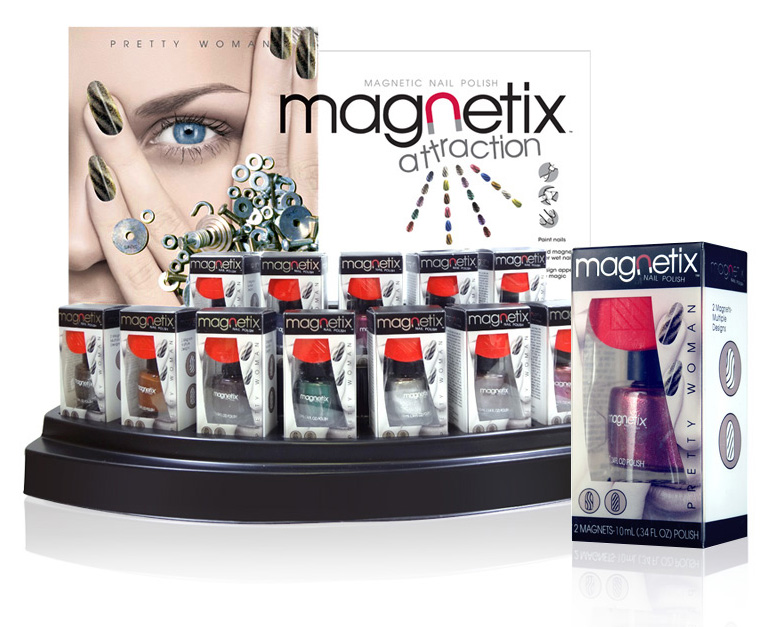
| Fichthorn Designs Magnetic Polish product line and Display for Rite Aid | |
Taking advantage of a new trend in nail polish, Fichthorn designed this stylish, compelling display and product line of magnetic nail polishes to captivate consumer's imagination. The design created instant awareness and understanding of the product benefit in the store invironment with a high end fashion appeal. "We were involved in every facet of the project from designing the header card and cartons to the 3-D design of the vacuum form tray." says Fichthorn. |
 |
| Gel Logic for Rite Aid | |
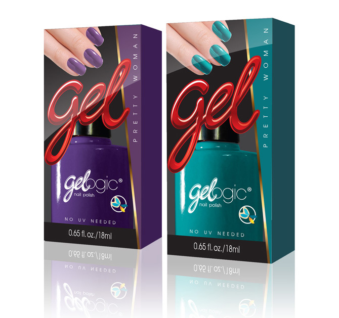 |
28 vibrant gel nail polish colors in 28 bold upscale packages. Fichthorn designed this line of nail polish to catch the trend and dominate the market segment with bold colorful graphics in a clear acetate carton with gold hot-stamping. A premium look that was well received by consumers and helped establish the manufacturer as an up and coming brand. |
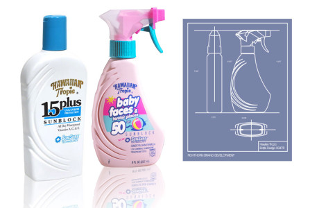
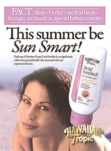
| Hawiian Tropic | |
We helped develop Hawaiian Tropic’s sun care brand with new packaging and print advertising. The sun care market was starting to become fragmented with new entries and HT was looking for fresh input to stay competitive. The solution was to target each demographic need with a unique benefit. We developed the “Be Sun Smart” ad campaign to appeal to each segment of the market. The campaign was a big success and acclaimed in Ad Age magazine.
|
 |
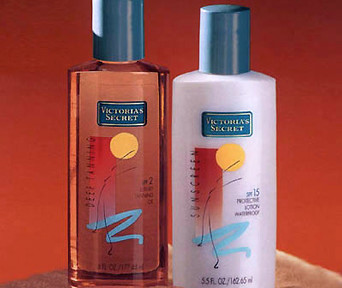
| Victoria's Secret asks Fichthorn for a new approach to sun care. | |
Victoria’s Secret asked Fichthorn to design a line of sun care products as a test market in their stores. They were looking for something different with a high end cosmetic feel. We designed this look with a loose interpretation of a woman stretching on the beach. It was expressive, conveyed an emotional life style impression and was very unique for the product category!
|
 |
| Fichthorn-the early years | |
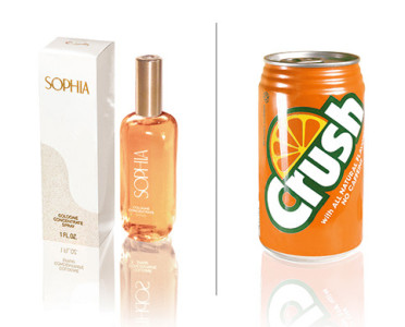
In 1981, Rick Fichthorn was finishing his Masters at Pratt Institute in Brooklyn, NY and working as a freelance package designer for Deskey Associates in Manhattan. While at Deskey he worked on several projects for companies such as Procter and Gamble, Coty and Crush International. Rick’s design manager was Ron Cohen, also a graduate of Pratt in industrial design. Two notable packages Rick designed while at Deskey, were Coty’s Sophia; a line of fragrances featuring the endorsement of Sophia Loren and Crush Soda. “When Ron approached me with the Sophia project, he said this was a pet project of his. He had been working on it for a while. He had the perfume bottles specially blown in Italy and had developed a unique “lover’s knot” symbol for the caps. He said they were having difficulty developing a design for the cologne carton. I spent 2 weeks generating about 14 designs for the carton before coming up with simplest, most elegant solution; a sine wave that wrapped around the carton. The carton was white with the name Sophia in gold hot stamp at the top. The bottom portion of the wave was a textured surface in off white. Well after the presentation to Coty, Ron came into my office and was ecstatic. Coty, and more importantly, Sophia Loren loved it and had signed off on the endorsement! |
so all of my designs featured the orange slice in a bold dramatic style. I then cleaned up the existing logo font, made it bolder and put it at an angle. This was innovative in 1981, and later imitated by other brands. I also integrated the orange slice into the logo font to make a more unified look. The presentation to Crush International by Deskey was well received and Orange Crush had a new look! |
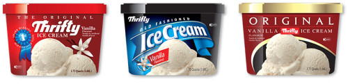
| Fichthorn redesigns thrifty ice cream. | |
Thrifty ice cream has a popular following on the west coast. When Rite Aid bought the Thrifty chain, they changed the store names but kept the Thrifty name on the famous award winning ice cream. In 2007, Rite Aid asked us to redesign the cartons. The line included over 40 popular flavors such as Chocolate Chip, Coconut Pineapple, Cotton Candy, Butter Pecan. Our approach was to highlight the ice cream withhigh quality photography to maximize appetite appeal. We dramatized the colorful flavors against a black background and used |
|
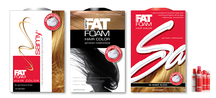
| Sammy asks Fichthorn to design new hair dye package | |
Fichthorn recently designed a new package for the manufacturer of Samy Hair Products. Their new product, a hair dye that forms a thick non-drip foam, required a bold dynamic and descriptive design to help communicate the benefit to consumers at point of sale. The Fichthorn design was well received and is currently in stores throughout the country.
|
 |
| More Corporate ID | |
 |
|
| Mass Market Retailer / Editorial | |
One question that design firms invariably receive from prospective clients is what kind of return can they expect from investing in high-quality design services. A recent study conducted by the London based British Design Council, a publicly funded advocacy group, shows that good design does, in fact, payoff. The study tracked the share prices of 61 companies that were well known for their investment in design. It found that these companies outperformed the Financial Times Stock Exchange 100 (FTSE1 00) stock index by more than 200%. That performance signals a significant return by any measure. A strong brand is a quantifiable asset, an important dimension of the goodwill that is listed – with a value – on the balance sheet of publicly traded corporations. Package design is often the customer’s primary visual exposure to that brand – in effect, it is a piece of the company’s goodwill that they take into their homes and with which they live. “Being part of a consumer’s life, and part of our clients’ listed assets, is an important position to be in, and we never take it lightly” says Karen Fichthorn, director of account services at Fichthorn Brand Development Services. “As far as examples from our own work, we conservatively expect a 20% sales increase. But one of our favorite examples is a beauty product that we recently redesigned that resulted in a 400% increase in unit sales.” Fichthorn approaches package design in a way that is significantly different from other brand-development companies. “When we design packages we consider social aspects many other companies ignore, such as what is going on in the life of the target market that would make this product necessary,” says creative director Rick Fichthorn. “What other trends in design, such as fashion, furniture, and industrial design, has this market been exposed to?” For younger market segments especially, even music has an influence on their perceptions, he adds. “We feel design is an integral thread of the social fabric, and that makes us different” he says. Rick Fichthorn notes that social trends generally manifest themselves in all aspects of design, including package design. For example, young people are currently looking for products that are “real” or “genuine,” he explains. They shy away from brands they perceive to be overly commercial and corporate.
|
At the same time, though, these young consumers have been raised in a commercially oriented culture and are hesitant to stray very far in their search for the “real” or “independent” look. “We have reflected this in our recent work, through the use of graphic elements that are a little looser, fonts that are less rigid, and colors and imagery that resonate with this lifestyle,” says Rick Fichthorn. “We’ve been busy balancing the sometimes opposing perceptions of what consumers perceive as ‘real’ and what they perceive to be ‘effective.’ We expect this trend to continue for the next few years.” For the long term environmentalism will become more mainstream, and brands will need to address environmental issues while maintaining their brand equity and perceived quality. Fichthorn has been encouraging its clients to tell their environmental stories on their packaging and giving them fresh new looks to support it. “Globalization is also continuing to show up in our work,” says Karen Fichthorn. “We recently did a brand with the copy in English, Chinese, Japanese and Korean. The instructions were extensive, and we solved the space problem by communicating with pictures.” For manufacturers and retailers who want to be more successful with their brand identities, she suggests that there are five ways to maintain a competitive edge: *Package designs should be refreshed and evolved every three to five years. Staying current with market trends is crucial, because every consumer generation wants its own identity. *Companies should seek out opportunities to speak to their customers on their level, whether that means adding SKUs, improving product benefits or evolving their packaging graphics. *Marketers should not be afraid to take risks. The leader stands alone. *Companies should distinguish themselves by identifying their strengths and stating them boldly. *However, customers’ intelligence should be treated with respect. Exaggerated product claims are obvious and easily dismissed. Fichthorn’s design philosophy can be summed up by the following statement: Design is communication, good design is understanding, excellent design is identification. “It’s when the observer says ‘That’s me, I want that,’” says Rick Fichthorn. “We provide design excellence for our clients, which means we create imagery that speaks to their customers. This translates to bottom-line success.” |
| An Interview With Fichthorn | |
Rick Fichthorn is a graduate of Pratt Institute in New York City, with a BS and MS in Communications Design. While working for Deskey Associates, NYC, he designed the packaging for Orange Crush.
In 1984 he and his wife Karen founded Fichthorn Associates. As of 2000, their firm has designed more than 6000 packages for high end manufacturers and retailers throughout the country. Interviewer: Rick: Interviewer: Rick: Interviewer:
|
Rick: Interviewer: Rick: |
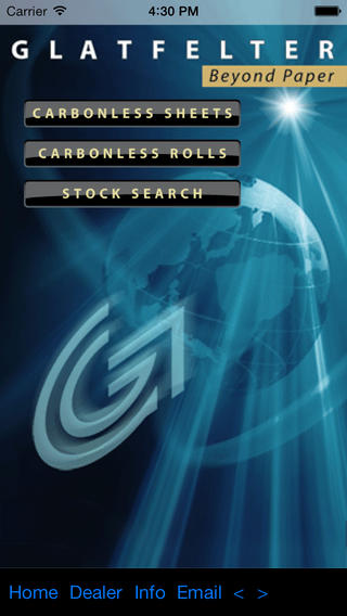
| Fichthorn designs Mobile App for Glatfelter | |
Glatfelter, global supplier and leading manufacturer of quality printing papers, specialty papers, and engineered and composite fibers products, asked Fichthorn to develop a mobile application for its customers. The app allows customers to quickly and easily choose a Glatfelter brand based on the criteria of type (roll or sheet), surface, and weight. After a selection is made, brand information includes an overview of the brand features and a complete stock list that includes all colors and variations. Click Here to view demo. Fichthorn developed an iPhone and an Android version. |
 |
| Mass Market Camera Packages Designed for Walmart | |
For several years GoPhoto asked us to design packaging for their line of cameras. Our designs were colorful, attention getting and conveyed a feeling of lifestyle and fun. |
 |
| Still more designs by Fichthorn | |
|
We can't show you everything we have designed over the last 30 years, but seriously, it's quite a large volume of work encompassing almost every consumer products category. |